User Interview Analysis
The Problem:
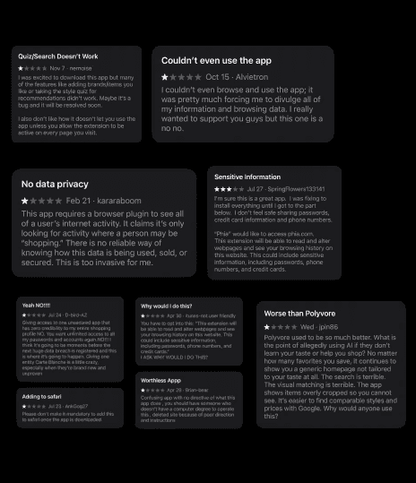
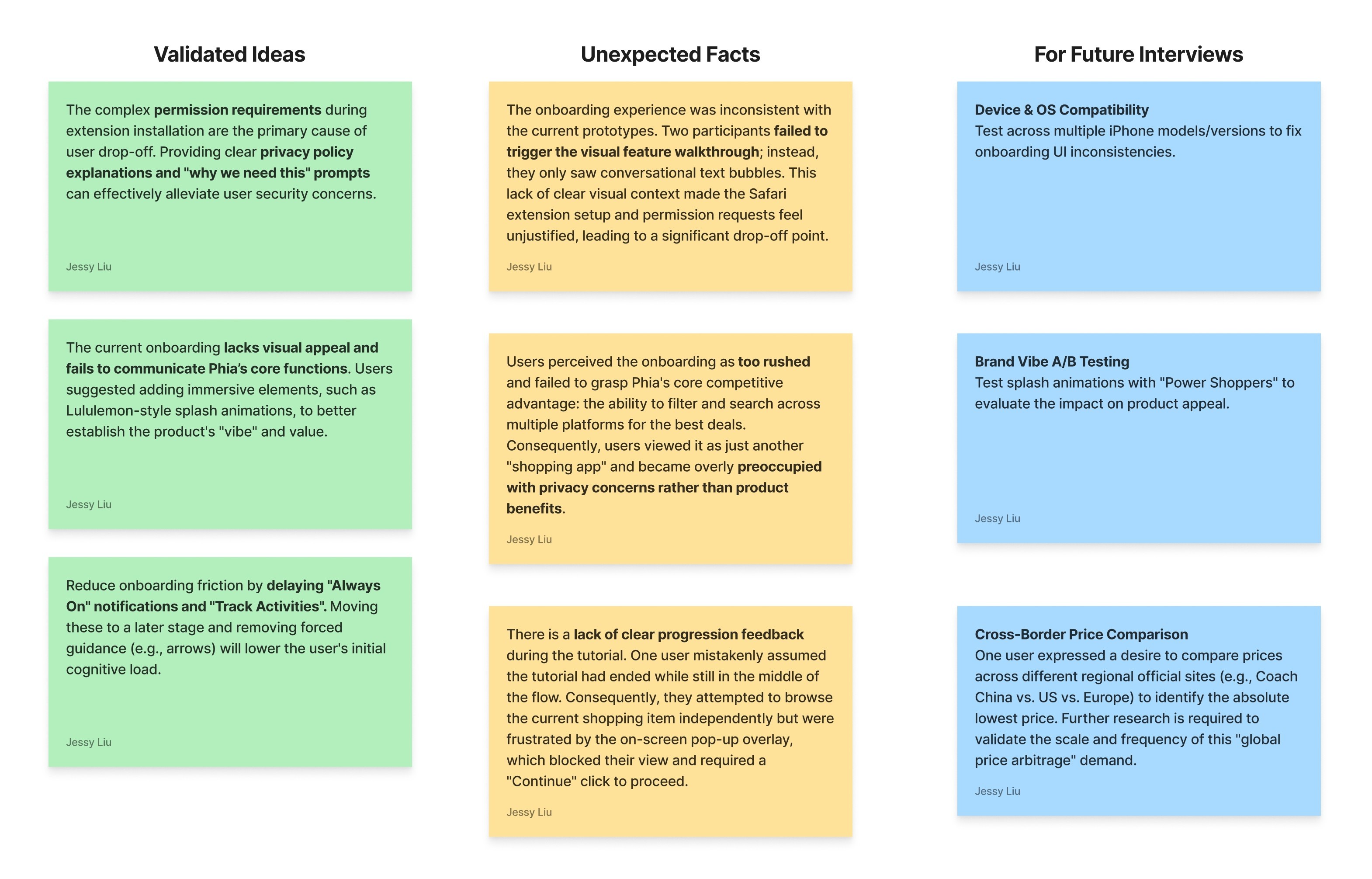
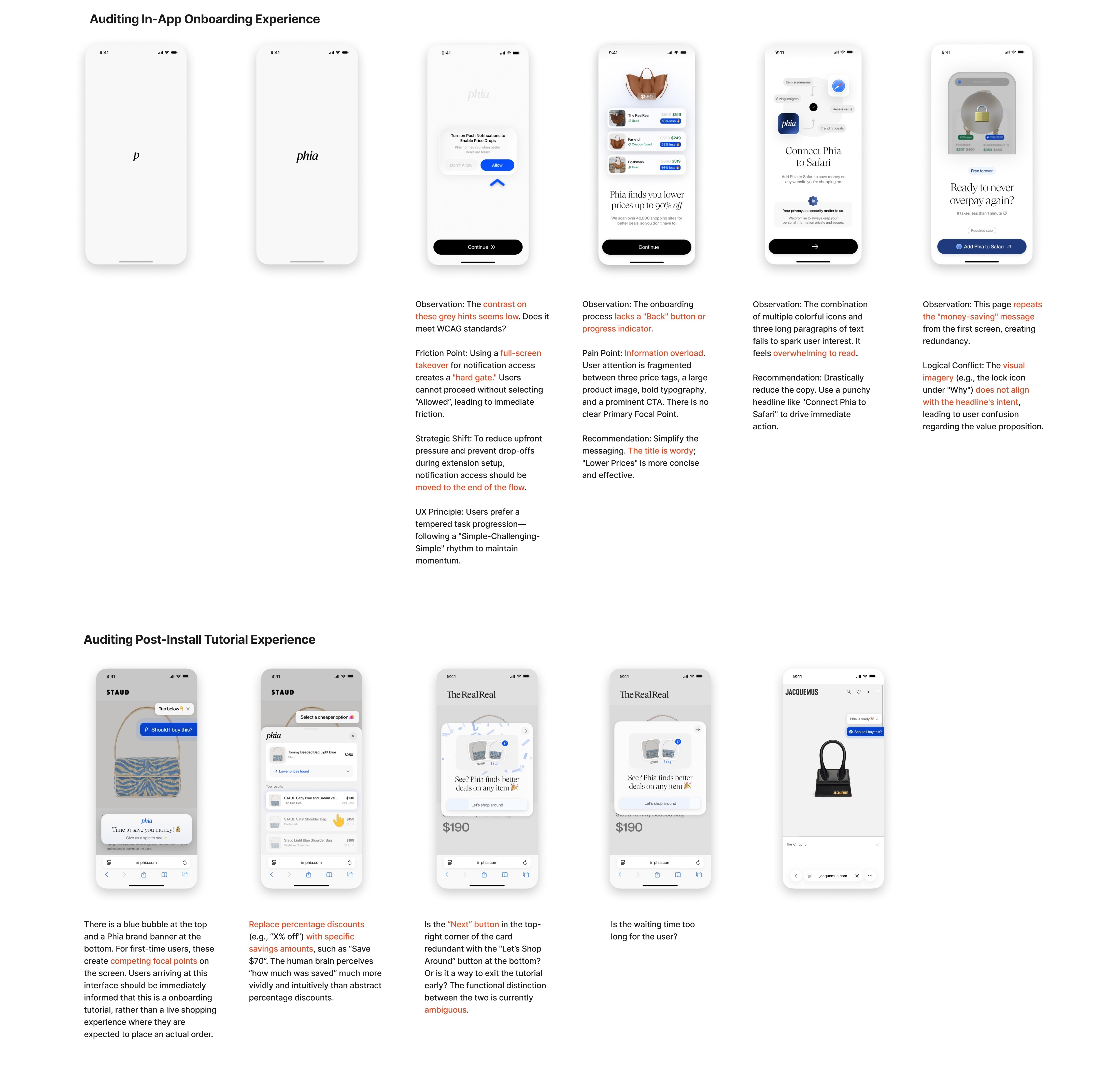
I identified several friction points where the design felt counterintuitive, triggering user drop-off. The primary issues during in-app onboarding stemmed from privacy and safety concerns, as well as full screen takeover to push users enable notification.
The main problem with the extension tutorial was the inconsistent indicators competing for focal points.
The Solution:
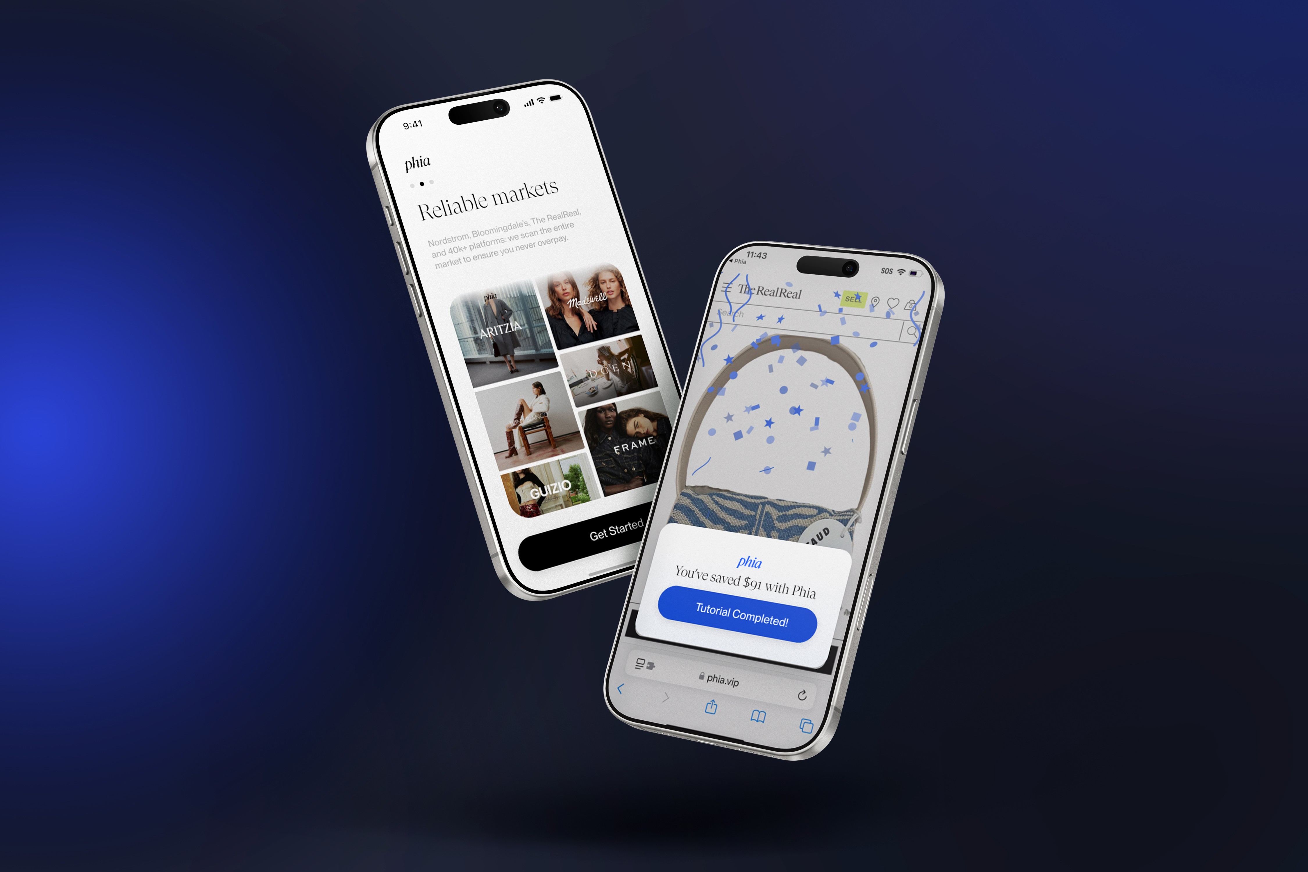
My goal is to realign the in-app onboarding experience with user intuition. The core strategy is simplification: adding safety and privacy statements and eliminate forced full-screen takeovers to give users a sense of control.
To resolve the inconsistent indicators in the tutorial, I standardized the user guidance to prevent users from getting lost on the page.
Standardized user guidance with blue visual cues to prevent users from getting lost on the page.
Simplified button copy for starting and ending tutorials to be more straightforward.